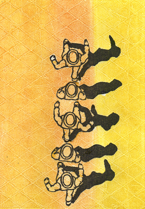
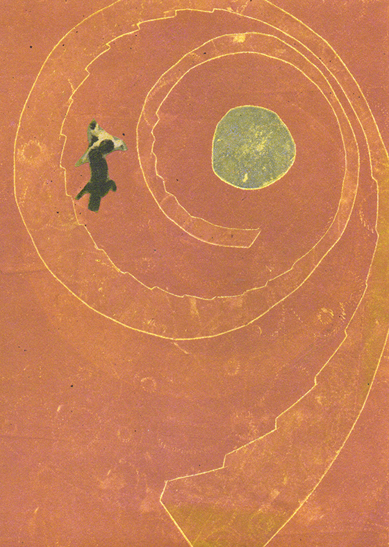
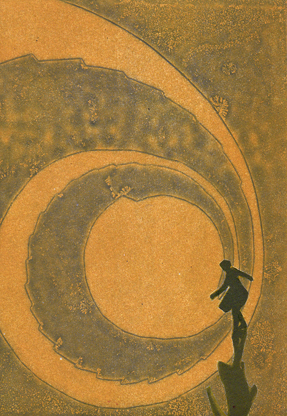
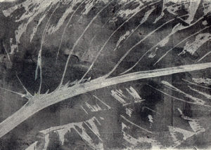
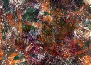
After trying my hand with my first two-screen print, I was ready for another challenge but didn’t feel like starting from scratch, so I cast though our vast catalogue of designs and grabbed the moon out of this pattern. It is called “The Countess contemplates another long distance voyage.” It is one of a few designs that I did using the same tile layout.
I printed the bottom layer in a light yellow on another piece of recycled linen-ish fabric from Scrap. The only difficulty in using mystery pieces of fabric is that I don’t exactly know what the fiber content is. I could only tell that this was not 100% cotton.
I tried a couple of different colors for the top layer, and I don’t know – I wasn’t in love with the results. This pattern is not as charming when it is out of registration. And I wasn’t sure if I liked it better with or without the top layer. But is the bottom layer interesting enough on its own?
After heat setting with the iron, I sent this through the wash on the hand-wash setting with really disasterous results. Most of the yellow ink (that I had thinned and extended with wallpaper paste) washed out, taking the top layer with it. It also got all over whatever else was in the washer with it. So I sent it all back through the wash again – this time on a regular cycle.
And behold the resulting fabric! Whatever parts of the top dark layer that had been out of registration with the yellow didn’t wash out, and because of that, it looks like it moved to the back of the yellow image, becoming a drop shadow. This was so much better than my intended design, and I never would have come up with this if I hadn’t printed with my improvisational ink mix onto mystery fabric and then nearly washed the whole thing out.
And here is my digital version of that design, which I had printed on Linen Cotton Canvas at Spoonflower.
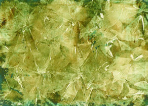
I’ve tried to duplicate that process to achieve a similar effect with different patterns and colors and fabric, but none have washed out in quite the same way. I guess I can’t be too sad when I accidentally wash a print out completely. It’s part of the process of experimentation that sometimes leads to great discoveries.
It was the concept of this very pillow that somehow kicked me off onto the roll that I currently find myself on, but I would like to report that I did actually manage to print enough fabric to make the pillow (with white piping and a feather insert), and despite adoring this thing more than any other thing I made this year, packed it off to my friend Steph for Christmas.
It’s very satisfying to make something out of the fabric that I have hand-printed. And it’s even more satisfying to give it away.
My original intention had been to print up enough fabric to make a pillow for Steph (my Princess Doraldina partner-in-crime), sew up a pillow for Christmas, and surprise her. But I couldn’t wait that long to share what I had done with her 1000 Flowers pattern, so I texted her some photos of what I’ve been up to. And with that, we’ve been off on a roll, developing a collection derived from my screenprinting experimentation.
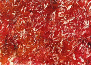
Here are some samples. Some of my printing is a little spotty. I’m quickly learning that the number of passes with the squeegee makes a big difference, which is no surprise. I tried bleaching some color out of the plain blue fabric on the lower right piece, and adding color in to some plain muslin first with an attempt at food coloring dye (with unimpressive results), and then just painting on a thin acrylic wash. (I’m not sure how well any of these pieces would hold up in the laundry.)
Over the course of the week, I also switched from cutting vinyl templates to developing screens with photo emulsion. After only two tries, I managed to find the right recipe of time and exposure to a surprisingly good image, and I made a screen using Princess Doraldina’s Long Distance Lovers pattern.
I figured that I had better try out the repeat on paper before graduating to fabric, which was good, because I had not yet figured out what the top/bottom repeat was yet.
While micky-mousing around trying to work out the repeat, I decided that it was also time to try my first two-color print, and since I didn’t want to waste any fabric yet, I printed it first on a scrap paper print, and then on scrap fabric.
I was surprised and delighted with the results! So the next morning, I patiently worked out and taped off the repeat, and managed to print a couple of half-way decent pieces of fabric. It has all kinds of omissions and registration errors, which is part of its charm.
I would love to cover a couch with this. It’s going to take more than 2 yards for that, though.
After doing so much digital textile design for Princess Doraldina over the past couple of years, I was craving working directly with fabric again, so I set myself up to do a little screen-printing, and have been experimenting with various techniques on recycled fabric that I picked up at Scrap SF.
Working with my pal Stephanie Mesner’s One Thousand Flowers pattern that I helped her develop last summer for Arteriors, I cut a vinyl stencil and applied that to my screen. The pattern has a lot of intricate details which were not conducive to being cut from vinyl at this small scale, so I drew in some of the missing details using Elmer’s washable glue, which worked pretty well as a temporary screen filler, though it doesn’t survive a screen washing. (If you are going to use it for this purpose, you have to reapply it before each printing, which can get a little tedious.)
Using masking tape and a sharpie, I managed to pull off registration for 6 pattern repeats. These are definitely very far from perfect, but the pattern is pretty forgiving. I didn’t even wait for the ink to dry between the repeats, I just blopped the screen in and printed the middle sections. It did take me 3 tries to come up with 2 decent pieces of fabric that I can make pillows out of, but for improvisational fabric printing, I was pleasantly surprised with the results.
For this sample, I initially placed a piece of vinyl directly on the fabric and hand-cut a quick harlequin pattern, then sprayed it with some Clorox foaming cleaner, and let it dry in the sun. It didn’t look like it had had much effect, but after I printed the white, ironed and then washed it, it came out like this.
The areas of the fabric that had been exposed to bleach actually held the ink better, and it washed out a bit in the unexposed areas, which I think creates a great effect. (Or it maybe vice versa. I have to do it again to determine which was which.) I love the distressed effect.
This sample is cotton. The samples above and below are some kind of synthetic blend, which bleach does not effect.
On this sample, I was trying to achieve a more opaque print, so I mixed wallpaper paste with my white ink, which created an almost Damask effect.
I just love high-contrast black and white patterns like these, and have wanted to design one for a while. I spotted these both on ladies’ blouses, and they look so nice on a chiffon or some other light fabric. This one is not quite a tesselation, but it comes pretty close. You could almost flip the sailboat upside down in the negative space to create the same shape in black.
This one is just as lovely. The birds’ legs and long necks break up the black space and create a stripe or almost a herringbone.
So here is my version of a high-contrast black and white pattern. It is kind of okay, but not really there, and part of it might be that this is a flat digital mockup, but still, I thought it was missing something.
I compressed the swans together more, and inverted the overlapping portion. I also added orange beaks.
Here it is again with black beaks. I think this might be getting there. It’s got a different feel than the ones above, but it is better to be inspired by, not to copy, I suppose.
I’m quoting The Hardly Boys film by William Wegman here. But that feels appropo on days like these, when one might feel compelled to paint the same scene over and over and over in some attempt to get it right. Here they are:
One place I have been lately, is in my studio, a place where I never ever felt that I could possibly spend enough time. My studio is chock full of art supplies, paper, unfinished projects, etc., and I had a running joke with myself that if I were ever locked inside, I could not possibly use up all the supplies I had. Whoever would have guessed that this would more or less come to pass?
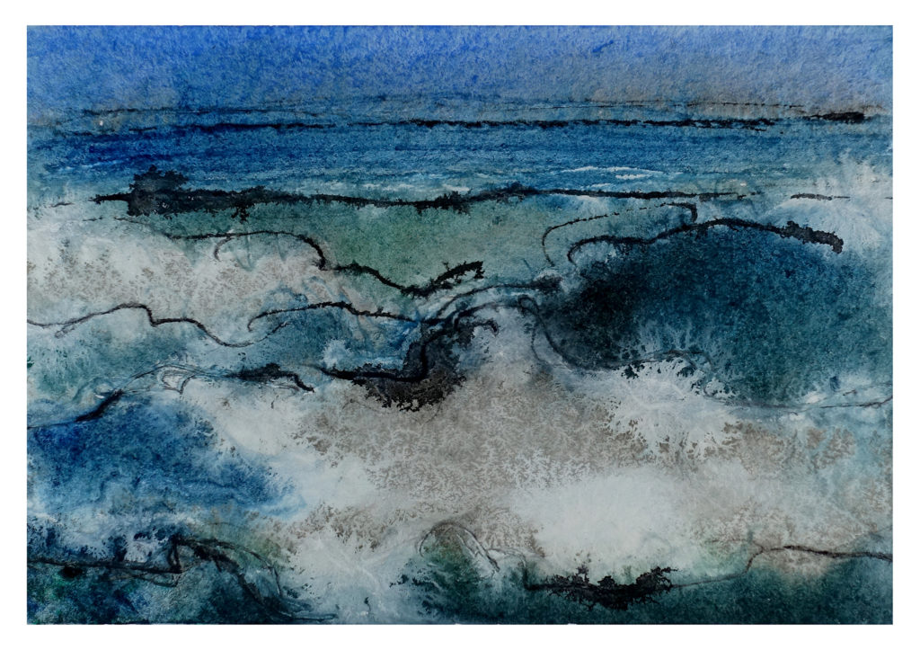
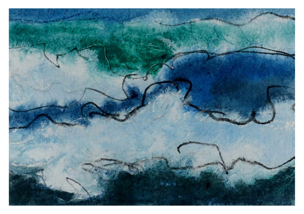
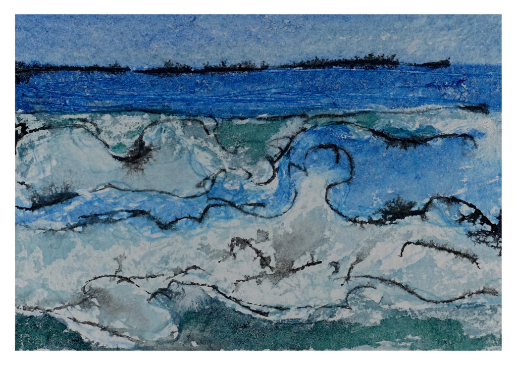
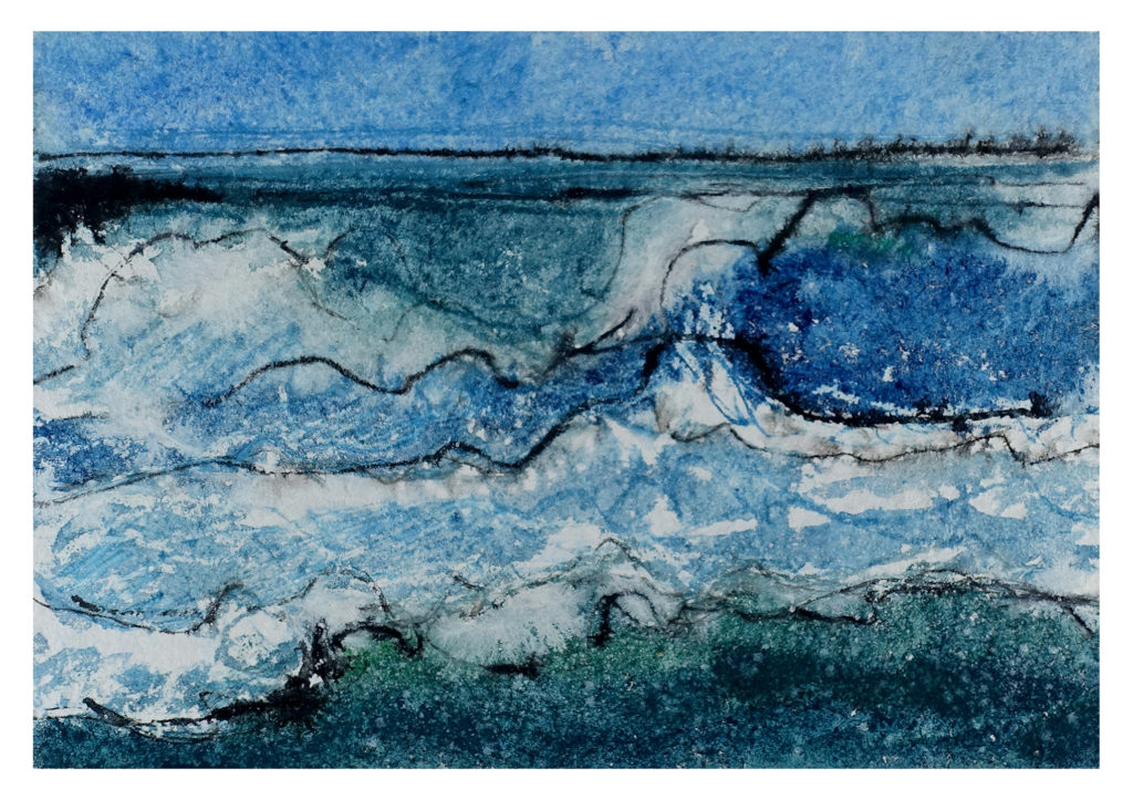
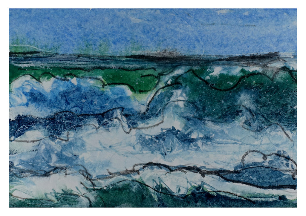
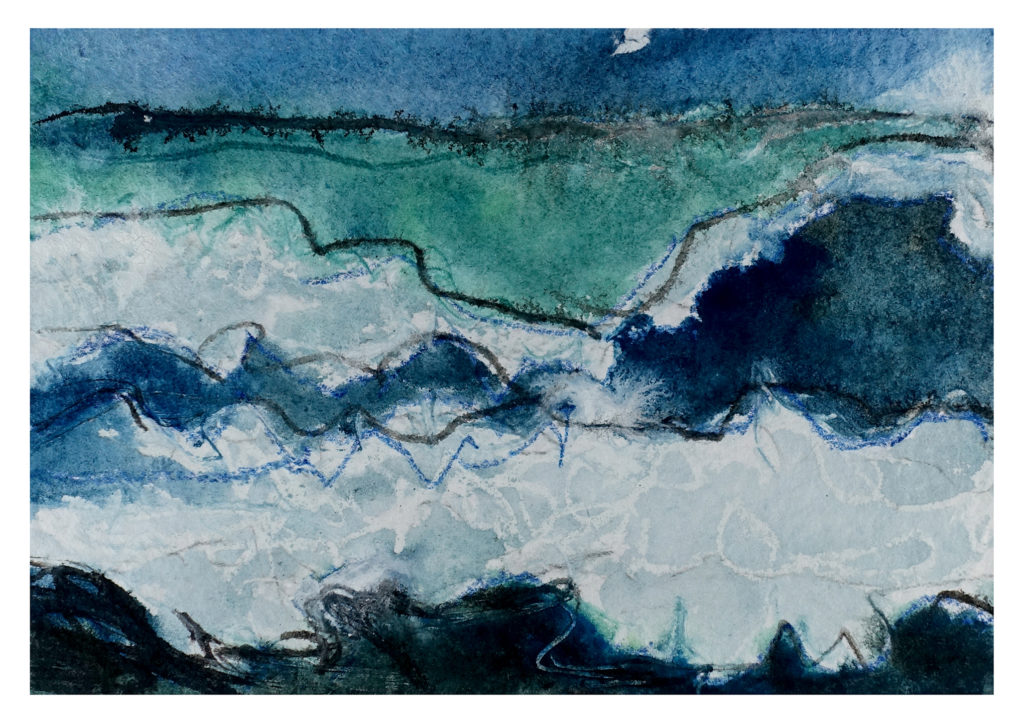
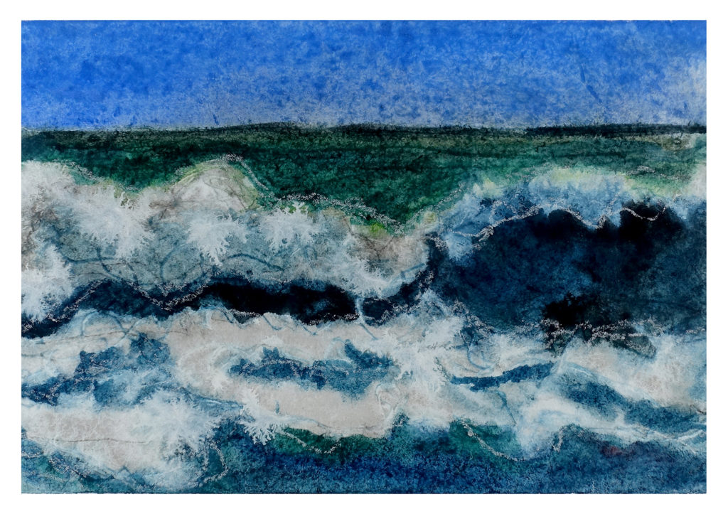
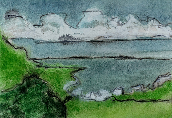
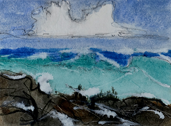
So I set out to try and try and at least use up the watercolor paper I had on hand, and started painting really quick gestural wet-on-wet landscapes, using pen, gouache, Daler-Rowney acrylic ink, and India ink. My husband calls them “scratch paintings.”
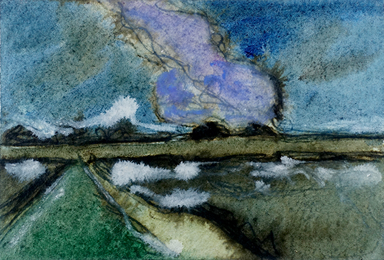
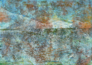
Freshwater, Newfoundland – I have been here.
Sometimes I work from my photos, and sometimes I page through photos on Flickr, painting places where I have never physically been, but now at least have virtually been, thanks to the generosity of many fine photographers.
I haven’t been here, but it reminds me of a place where I have been.
While I have been painting, I have been listening to Dorothy Dunnet’s The Lymond Chronicles (my second time through this series), which has been incredibly transporting. As a result, I have knocked out about a zillion of these things, and feel compelled to keep going, even though I am starting to feel like Jack Nicholson in The Shining, except that instead of boxes of typewritten pages, I have boxes of watercolor paintings.
If I haven’t been here, I have been to a place a lot like it, and can’t wait to go again.
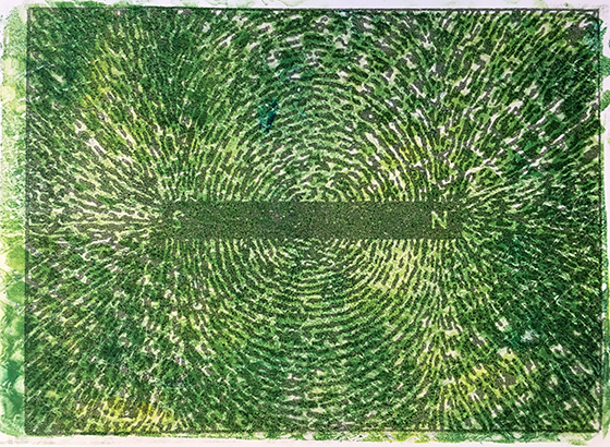
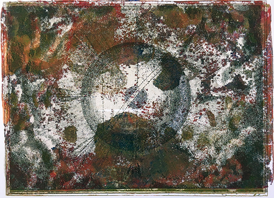
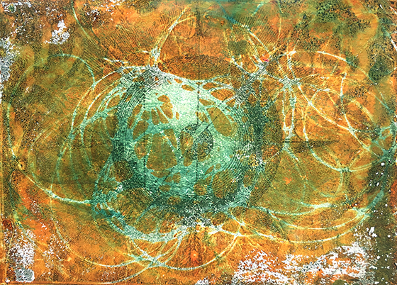
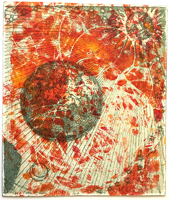
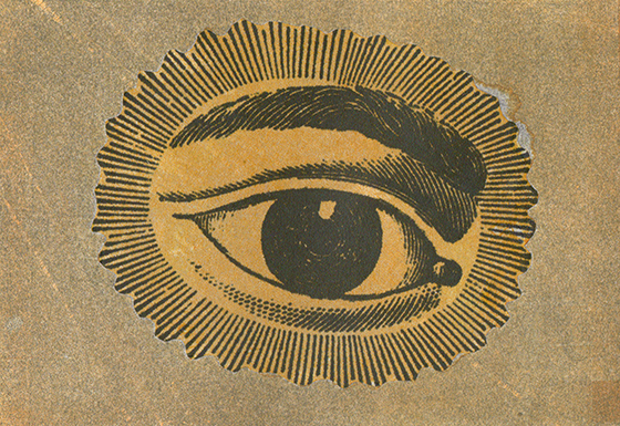
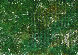
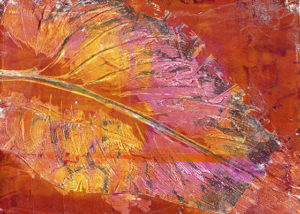
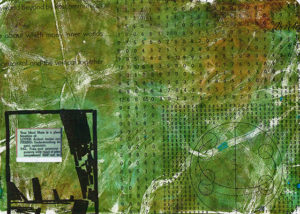
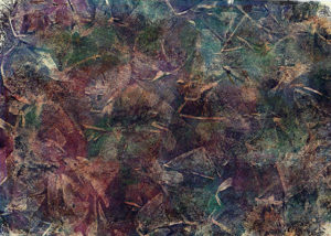
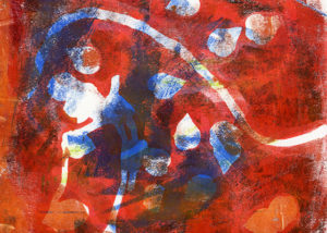
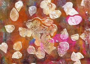
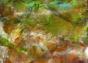
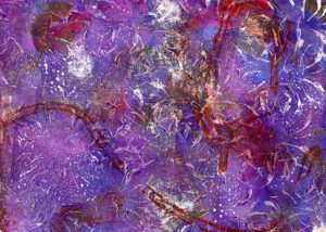
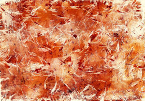
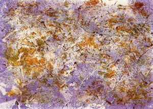
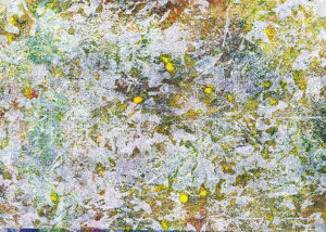
I recently took a really great monotype printing class here, and we learned Chine Colle, which was right up my alley. Here are my first batch:
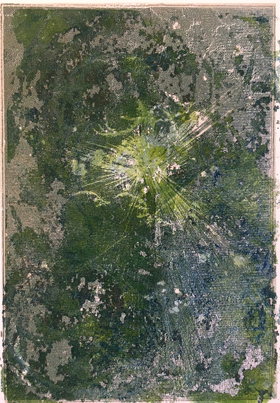
I was trying to salvage a bad print here
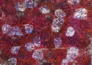
This was a better salvage of a bad print
Too bad the eye is slightly weirdly rotated.
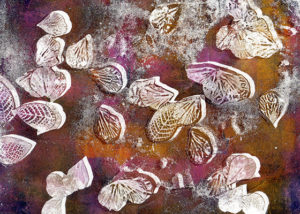
Given a little more time to plan and a little more patience with actually placing the glued image on the background, I can see that I could really go nuts with this process.
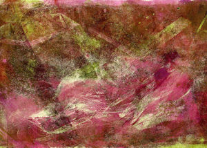
After a few months of feeling like I never have enough time to just totally noodle around, I got on a roll and made these all in one day. I certainly went on an improvisational journey…